While slogan tees dominated much of 2026, a quieter direction gained ground: brutalist graphic tees and Bauhaus-inspired t-shirt designs — strong geometry, high contrast, raw type, and deliberate negative space.
For wearers searching “minimal geometric tee,” “brutalist shirt,” or “Bauhaus graphic t-shirt,” this is the clean alternative to another viral slogan.

Photo: Bauhaus geometric graphics — via @recraftai

Photo: Bauhaus pictogram variation — via @recraftai

Photo: Bauhaus graphic system example — via @recraftai

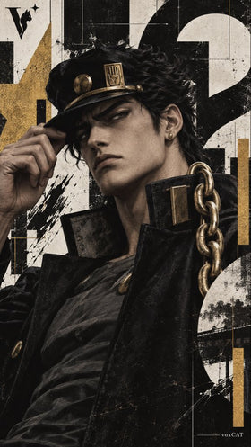
Photo: Brutalist graphic design system — via @VoxcatAI

Photo: Brutalist composition variation — via @VoxcatAI
What Brutalist and Bauhaus Tee Graphics Look Like
Bold geometric shapes. High-contrast color — often black, white, and one accent. Condensed typography treated as architecture. Grid logic and spare composition. Bauhaus leans primary forms; brutalist leans mass and raw concrete energy.
Why Geometric Graphics Work on Heavyweight Tees
High contrast suits screen printing and DTG. Heavyweight cotton (260 GSM+) matches the architectural weight. Clean black-and-white geometrics stand out in feeds full of dense multicolor designs.
How to Style a Brutalist Graphic Tee
Let the tee be the structure. Simple trousers, good denim, minimal jacket. Competing patterns usually weaken the effect. One strong geometric idea per shirt beats busy collages.
Social Proof: Geometric Graphic Systems
How to Buy Brutalist Tees Without Looking Costume-Design
Favor one strong geometric or typographic idea per shirt. Avoid busy collages that try to be both brutalist and maximalist at once. Black, white, and a single accent color almost always outperform rainbow geometry. If the design looks like a poster you would hang, it will usually look better on a chest than a design that looks like a pattern fill.
Independent designers and small print shops have produced some of the strongest examples in 2026, partly because the aesthetic rewards restraint and craft more than viral slogans.
Why Geometric Graphics Feel Like a Reset
Slogan tees shout. Geometric and Bauhaus-inspired graphics structure the chest the way architecture structures a facade. For wearers tired of verbal messaging, that difference is the whole appeal.
High-contrast black and white, primary accents, and grid logic also print cleanly. Screen printers and DTG operators both benefit from designs that do not rely on delicate gradients. Heavyweight blanks reinforce the architectural read of the graphic.
This is not a rejection of personality. It is a different personality — design-forward instead of caption-forward. In a year crowded with loud chests, restraint became its own signal.
Who Should Buy Brutalist or Bauhaus Tees
Anyone who wants graphic presence without a sentence across the chest. Design students, architects, and minimal-leaning street style already embraced the look. The broader market is catching up because the pieces style easily with denim, neutrals, and simple outerwear.
Styling Mistakes That Weaken Geometric Tees
Competing patterns are the main problem. A brutalist chest graphic next to loud plaid and busy sneakers creates noise instead of structure. Let the tee be the architecture. Keep shoes, bags, and outerwear quieter so the geometry remains readable.
Color discipline helps too. Black, white, and one accent usually outperform rainbow geometry on the same shirt. Restraint is part of the aesthetic, not a limitation.
Frequently Asked Questions
What fabric is best for brutalist graphic tees?
Heavyweight cotton, ideally 260 GSM and above.
How is brutalist different from soft minimalism?
Soft minimalism uses delicate line art. Brutalist and Bauhaus emphasize geometric mass, structural type, and high contrast.
Are Bauhaus graphic tees hard to style?
No. They pair easily with neutrals and simple silhouettes because the graphic already provides the interest.
Is this a replacement for slogan tees?
No. It is a counter-trend for wearers who want graphic presence without verbal messaging.
Related Reading
Author: Shivam Das